Magnacor Masonry
Branding Jeffrey Turford
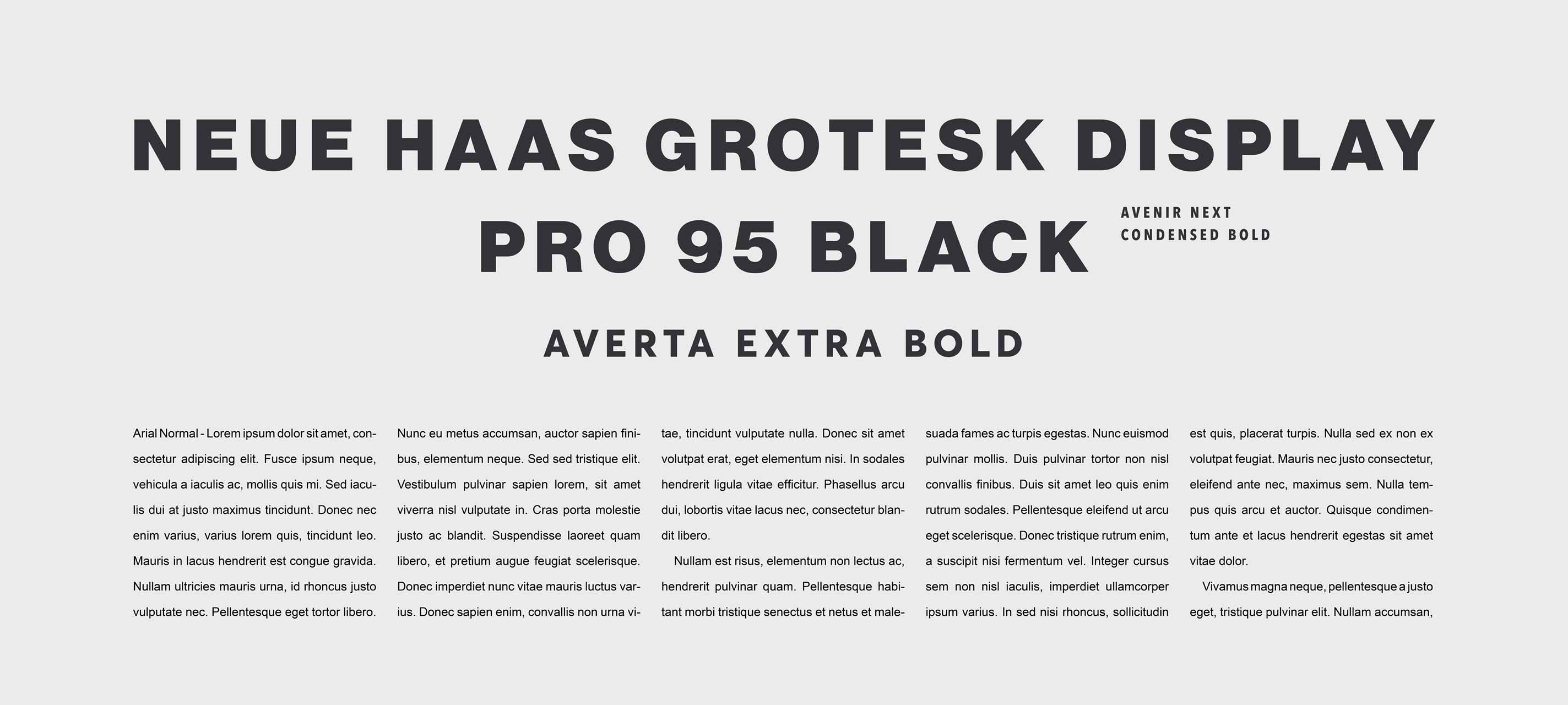
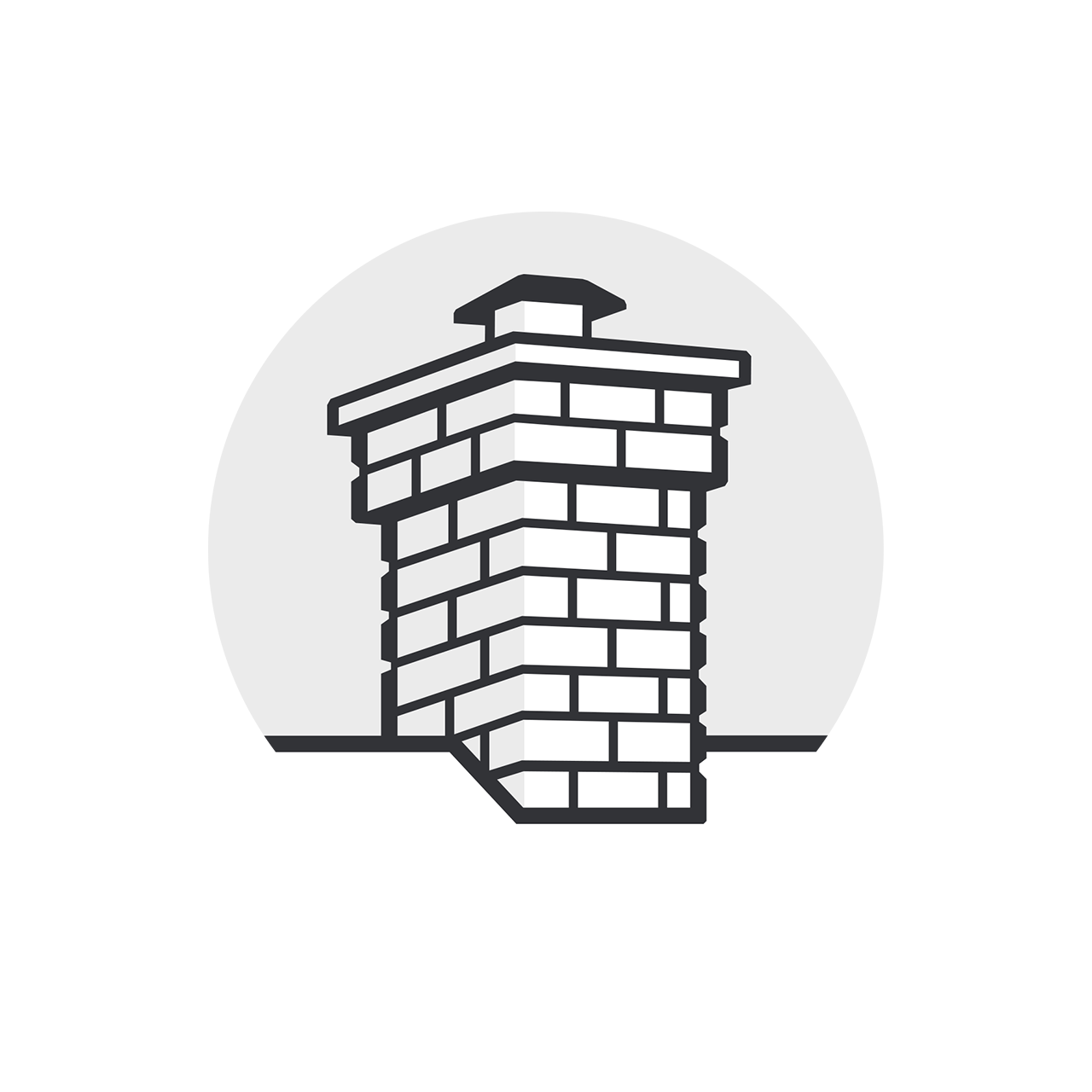
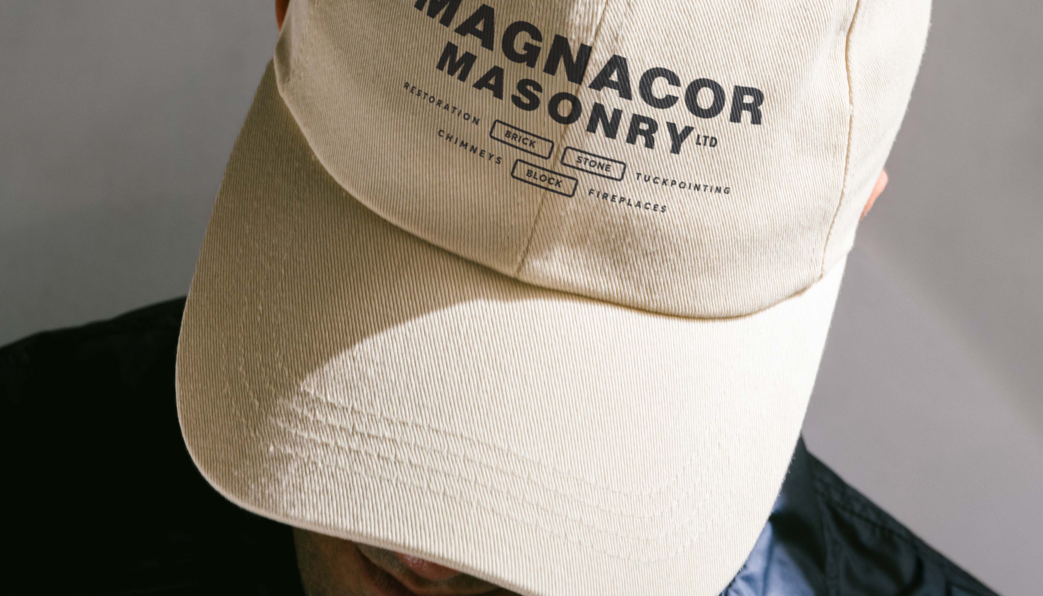
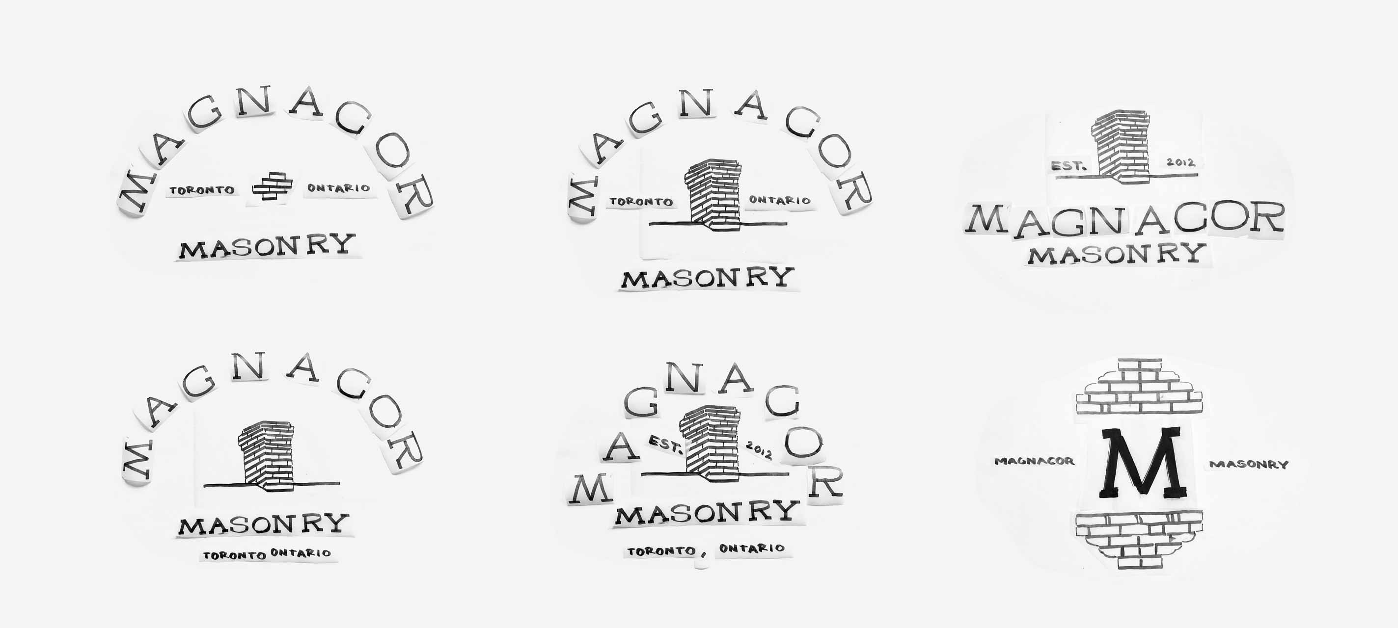
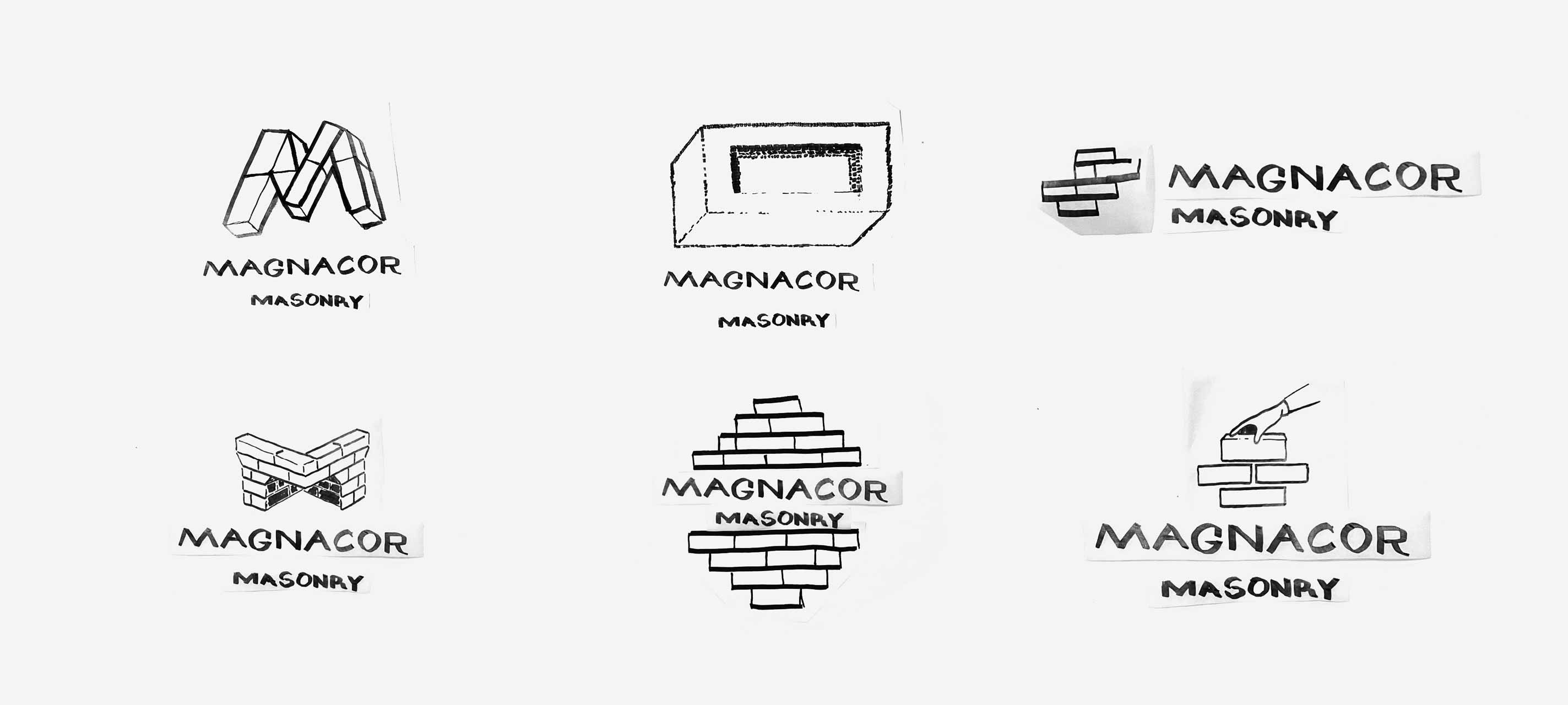
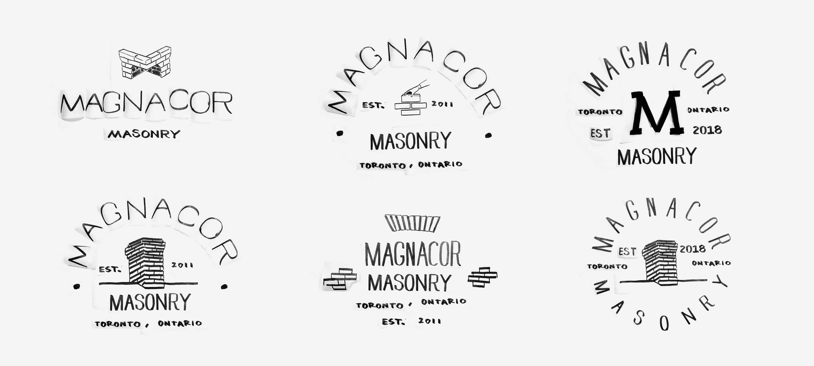
Magnacor Masonry was looking to rebrand their bricking company that had an outdated look. Through the design process we explored many different brand marks and landed on the visual of a bricked chimney paired with a bold typeface. The chimney mark would act as the brand shortform and be paired up with the logotype depending on the situation. A muted colour pallette was the preferred choice.